Pink palette
Pink Bridgerton Dress
By Bridgerton Dress Editorial
Blush is not one colour—it is an entire quarrel between bulb temperature, veil opacity, blush-on-skin cosmetics, and the undertone lurking inside the satin. A dress that sang in a north-facing showroom can blush too orange under warm marquee LEDs or drift grey under cold corridor spots. Practical shopping means testing fabric beside your throat in daylight when you can, and photographing the hanger in both warm and cool corners of the shop before you trust the till mirror.
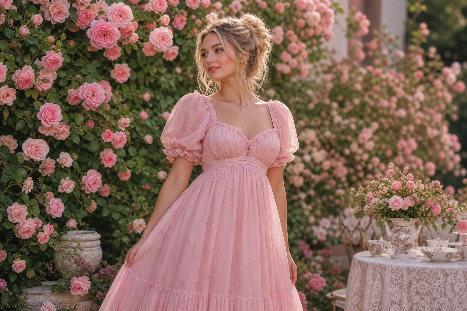
Undertone beats trend name. Shell, rose quartz, and English rose all sit in the pink family but lean different directions on warm versus cool skin. If you run warm, slightly peachy satins often harmonise; if you run cool, blue-leaning pinks can look cleaner under phone flash. The goal is harmony with your skin and with the partner’s outfit if you are pairing for photos—contrast is fine, accidental colour war is not.
Sheer layers, metallics and finish
Sheer overlays and “nude” illusion mesh need the same scepticism we outline on the white tonal page: mesh labelled nude is rarely universal, and contrast linings can bloom through panels when you bend or sit. Squat near the brightest fixture; daylight lies less than mood lighting, but both matter if your day spans registry office strip lights and garden string bulbs.
Pairing shoes, gloves, and jewellery with pink satins benefits from restraint. Metallics pick up whatever colour temperature the room throws; soft gold often flatters warm blush, while rhodium or silver can calm hot pinks. If you layer two pinks—sash over skirt—separate them by at least half a step in value or temperature so the eye reads intention, not a dye-lot accident.
Matte micro-crepe and satin with a little texture forgive flash more than mirror-bright poly. If you love high gloss, plan photography timing away from direct phone flash or budget a photographer who bounces light. High-street colour drops surface in Primark notes; couture or rental pieces still deserve the same bulb tests.
Volume, print scale and bridal clusters
Volume and train colour shift appear alongside movement advice in the ball-gown guide—wide hems read darker at the shadowed hemline; account for that when you match veils. Modern city edits that keep blush in rotation after the event sit in modern Regencycore.
Print scale matters. Tiny florals on blush can look busier on camera than in person; mid-scale blooms often read clearer in group photos. Stripes and ribbing that align with the empire seam help verticality; patterns that cut across the bust line can shorten the torso unless the tailor adjusts placement.
Swatches matter for bridesmaids clusters and mother-of outfits—mail fabric chips before you vote in the group chat. Screens compress nuance; “dusty rose” is a paragraph, not a hex code. When families mix pink with cream or ivory, hold the chips together under the venue’s actual bulbs, not only at home.
Readers logging zip dye rub-off, hanger fade, and dry-cleaner surprises feed reader reviews; check there before you assume your blush is “safe” synthetics. Wedding-day sequencing for tone-on-tone moments lives in wedding timelines.
Humidity, albums and when to email us
Heat and humidity shift pink toward orange; air-con dries some satins to a chalkier cast. If your day spans both, select a dye lot with enough depth to survive neither extreme looking like a mistake. A slightly deeper blush often ages better in albums than a whisper tint that blows out to white on print.
Email hello@bridgertondress.co.uk with “pink chip” if a seller’s photos disagree with arrival—documented pairs help the next reader more than venting on stories alone.
Explore more topics
Browse the homepage or the full topics grid.